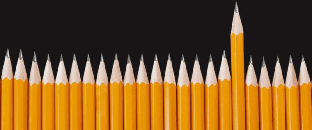
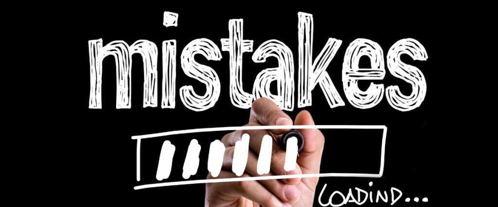
introduction An important component of graphic design is analyzing a company’s industry and illustrating its brand message. Any design error could have a detrimental effect on a company’s prospects. However, a well-planned and expertly created article can assist a firm in grabbing its audience’s attention and developing a reliable brand for them. You will immediately be impressed by large international corporations’ logos and other graphic design items. Everybody has a reason for designing logos and other graphics. Those designs were made with a carefully considered plan. That isn’t the case, though, with many company logos and graphic designs. Many startups neglect to plan their marketing collateral carefully. They ultimately lose their loyal clients to rival businesses. This is so because a logo, brochure, website, blog, packaging, or other design typically influences a consumer’s decision to buy, either directly or indirectly. These designs contain colors and other features meant to elicit specific emotions in the viewers. If the signals are strong enough, there is a good probability that customers will be drawn to the brand and its products. However, if a logo, website, brochure, or other design is created carelessly, it could harm a company’s ability to conduct business. For instance, a casual design logo may give customers the wrong impression of the company’s professionalism. People don’t appreciate such graphic design and move on to a better company with more important work. Below is a list of the top 10 graphic design mistakes: Not coming up with a flexible design The most useful visuals are timeless and versatile. When designing a logo, consider how it will appear on marketing materials, in full color or just one color, and whether it can be made simpler so that you can utilize particular design techniques on it. By doing this, you will develop brand consistency and avoid having to redo the artwork for future projects, saving you time and money. Check out SAGE ArtworkZone if you need assistance with your upcoming design job! SAGE ArtworkZone provides a wide selection of affordable graphic design services, from brand-new logos to distinctive commercials, thanks to our team of qualified designers! Using the wrong hierarchy In graphic design, a piece is ordered according to hierarchy so that the viewer can tell which aspects are the most crucial and how their eyes should scan the work. Looking at the components above, the flyer on the left’s flow makes it simple for the eye to travel and guarantees that your audience will reach the crucial details quickly. While the eye jumps around the flyer on the right in search of the crucial information. The best design strategy for classifying the importance of your content is the hierarchy. Whenever you create a new design, you normally have one overarching theme in mind. Your audience’s interpretation of your design will depend on how you build a hierarchy, whether you’re promoting a sale, an impending event, or a new blog article. You can effectively build a hierarchy using colors, graphic components, the weight of the fonts you choose, and font size and location. Having limited whitespace Another design mistake to avoid in 2020, according to Daniela Verduga, Designer at Visme, is a lack of whitespace. According to Verdugo, “a common mistake for non-designers or clients is overloading your design or trying to fill every area.” On the other hand, white space can save designs by making them understandable, aesthetically pleasing, and clutter-free. Negative space, commonly referred to as whitespace, is essentially the uncluttered area in a design. It doesn’t imply a white background and nothing but space. On the other hand, white space refers to all unmarked areas that can be any color, backdrop, picture, pattern, or texture. Your design is more elegant and draws attention to particular design components, like your call to action, which makes your message stand out. According to research, white space can boost comprehension by up to 20%. The Overuse of Fonts Using too many fonts in a design project is the first error many inexperienced graphic designers make. This can make the message difficult to understand because it doesn’t adhere to font psychology. It also distracts your design because too many elements make it look amateurish. This rule also applies to logo design; using too many fonts will make your logo appear amateurish; instead, stick with one or two complementary fonts. If you want a pro tip, use the same font in a variety of weights; this will make your design appear more polished, professional, and like it has a clear message. Selecting the Wrong Colors You can learn more about the various meanings of colors by reading my post on color psychology. Colors have their meanings and are connected to various feelings and emotions. Common mistake beginning designers make is selecting the wrong color for their design, which makes the message difficult to understand or causes the viewer to perceive the opposite message. Another mistake by novice designers is disregarding color theory and using poor color palettes, making the design look bad and unprofessional. If you use too many bright colors without contrast, your design will be difficult to read. Instead, you should learn color theory to understand how colors interact with one another and use proper color palettes. Under-Delivering Despite Over-Promising This is the most serious and potentially harmful error of all those we’ve discussed thus far. According to the Go Layer Cake website, you’ll rarely find a “fast” job in graphic design. Therefore, you should be careful not to offer them an excellent promise while discussing deadlines and expectations with your client and then break that promise. Doing a project before a lengthy deadline is preferable to finishing it after a brief deadline. To avoid project delays, you may always engage a freelance graphic designer with a solid portfolio for your design requirements. Making Designs for the Wrong Platform This is a common mistake made by beginning designers. They are designed for the wrong platform and select the wrong color mode. For example, some
 Skip to content